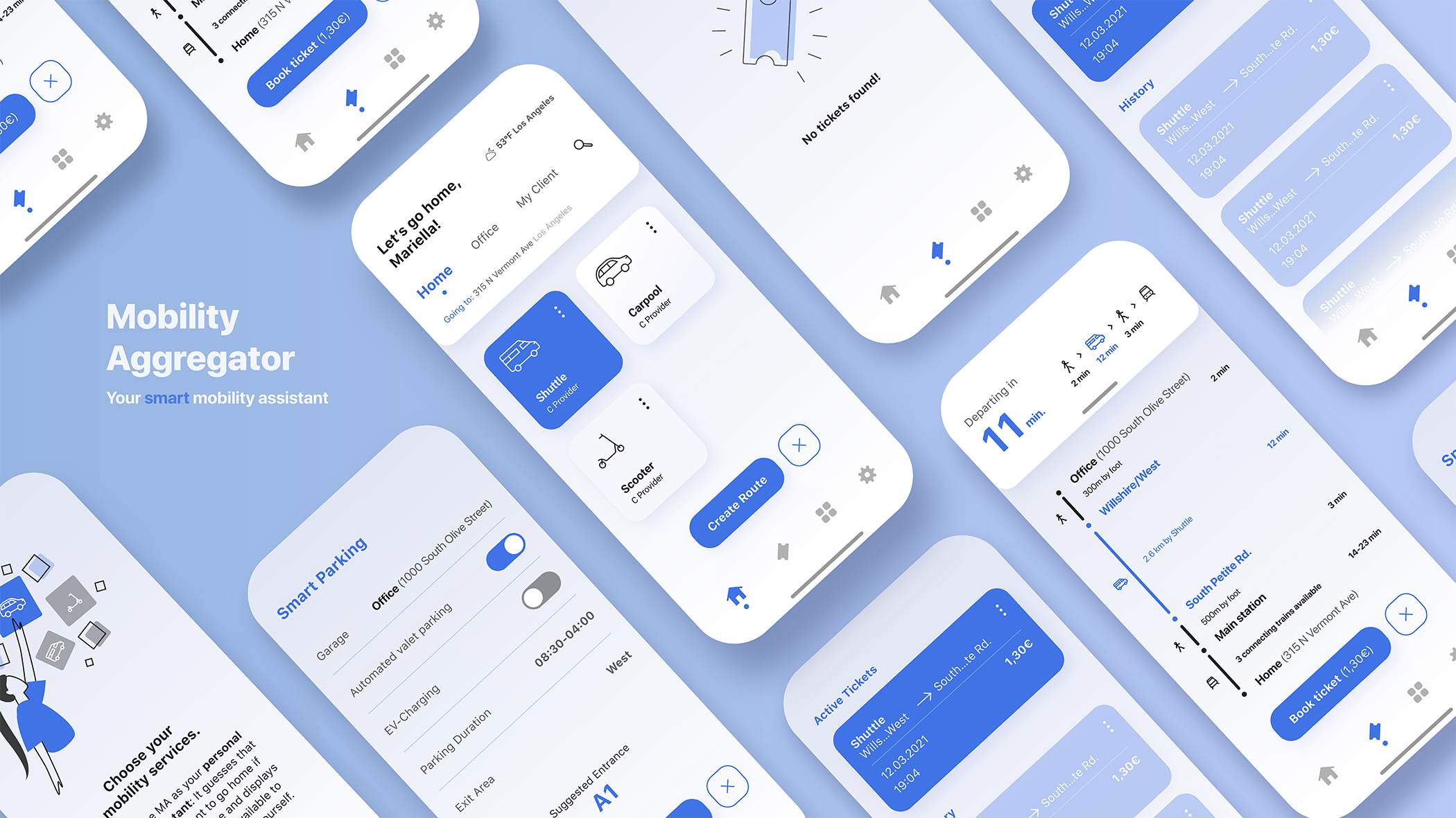
Mobility Aggregator
Bosch · Created during my 3rd semester in 2019
During my practical semester at Bosch's "Urban Mobility" Department my team worked on the "Mobility Aggregator" B2B2C solution, that opted to combine several in-house mobility solutions into a single package. One key user pain the app solves is the "Last Mile", the distance between f.e. train stations and their final destination, making it one of the first "door-to-door" mobility solutions.
Categories:
Concept
Service Design
UI Design
The idea of the mobility aggregator was to place several mobility solutions from Bosch’s portfolio into one service. The customer target groups with the biggest needs in this field were identified as real estate companies, who search to make themselves more attractive to potential residents, as well as big corporations who concern themselves more and more with staff mobility. Thus, this service is a B2B2C solution, which poses the challenge of the customer, the one who buys your solution, not being the same as the actual user of the product.
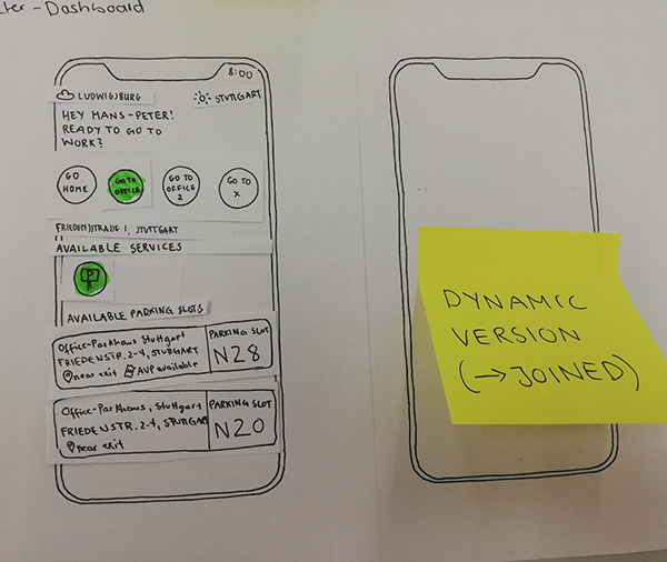
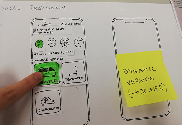
We started with workshops and interviews with real estate customers in the USA, as well as a market research, to get a feeling for mobility aggregation and how it’s already been done by competitors, like Free2Move, Moovel or urbi. In the interviews we found, that a huge pain of our users was not the commute itself, but getting to train stations, bus stops and the likes: The last mile. This helped us shift our focus from a mobility aggregation app with intermodal routing to a multimodal approach. And a "personal assistant feel", something that’s smart and already knows what you need before you do. The app is supposed to guess that the user probably wants to go home based on different parameters, such as location, time or calendar entries and suggests last mile solutions available around them, like Shuttles, Kickscooter or Ridesharing options. Information about connecting public transport options would be available, but unlike the Last Mile Solutions, not for purchasing tickets or detailed routing. This also helped to place Bosch solutions in the last mile, which presented itself as an asset to our customers, since Corporations and Real Estate could use these solutions to make themselves more attractive for potential residents and employees.
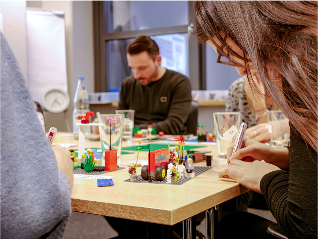
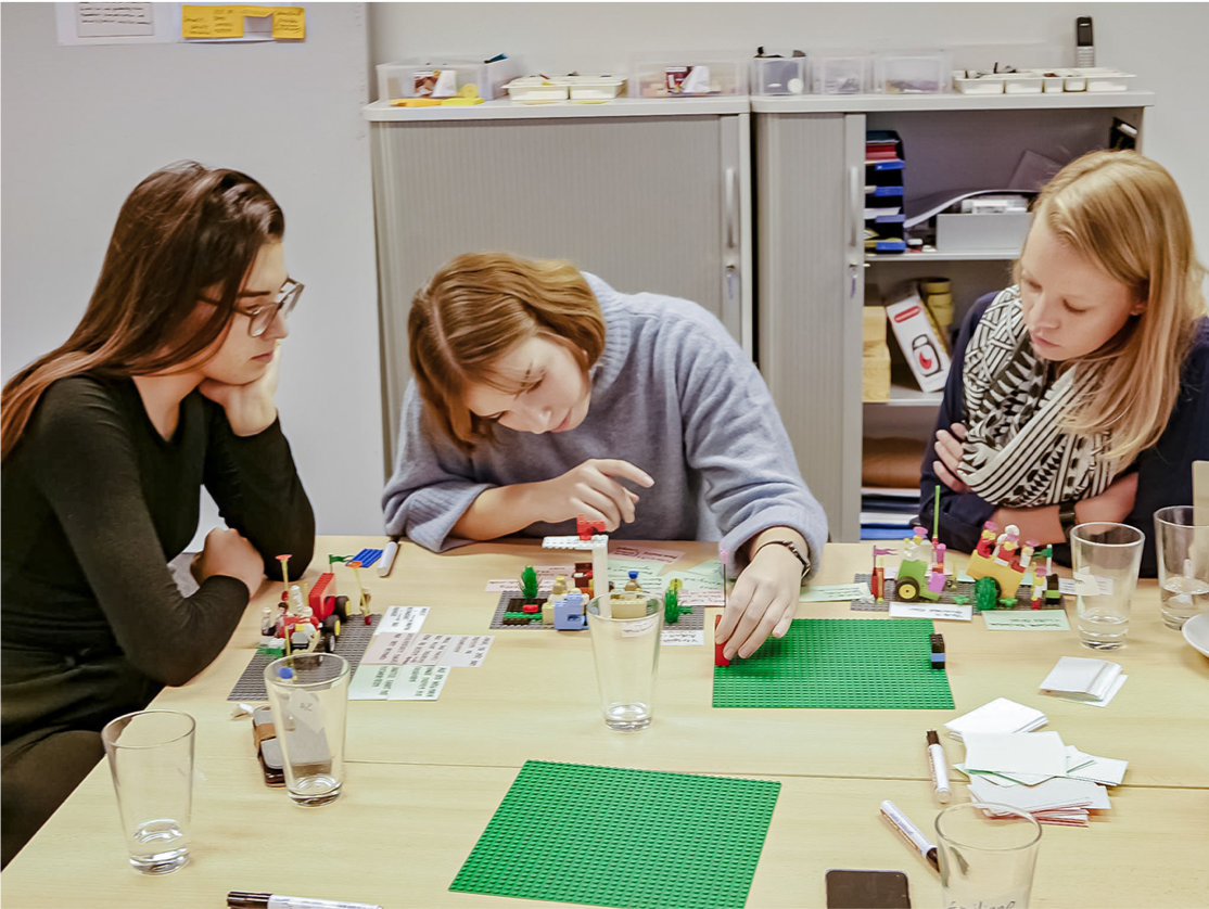
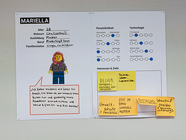
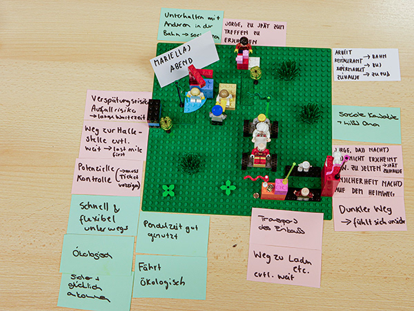
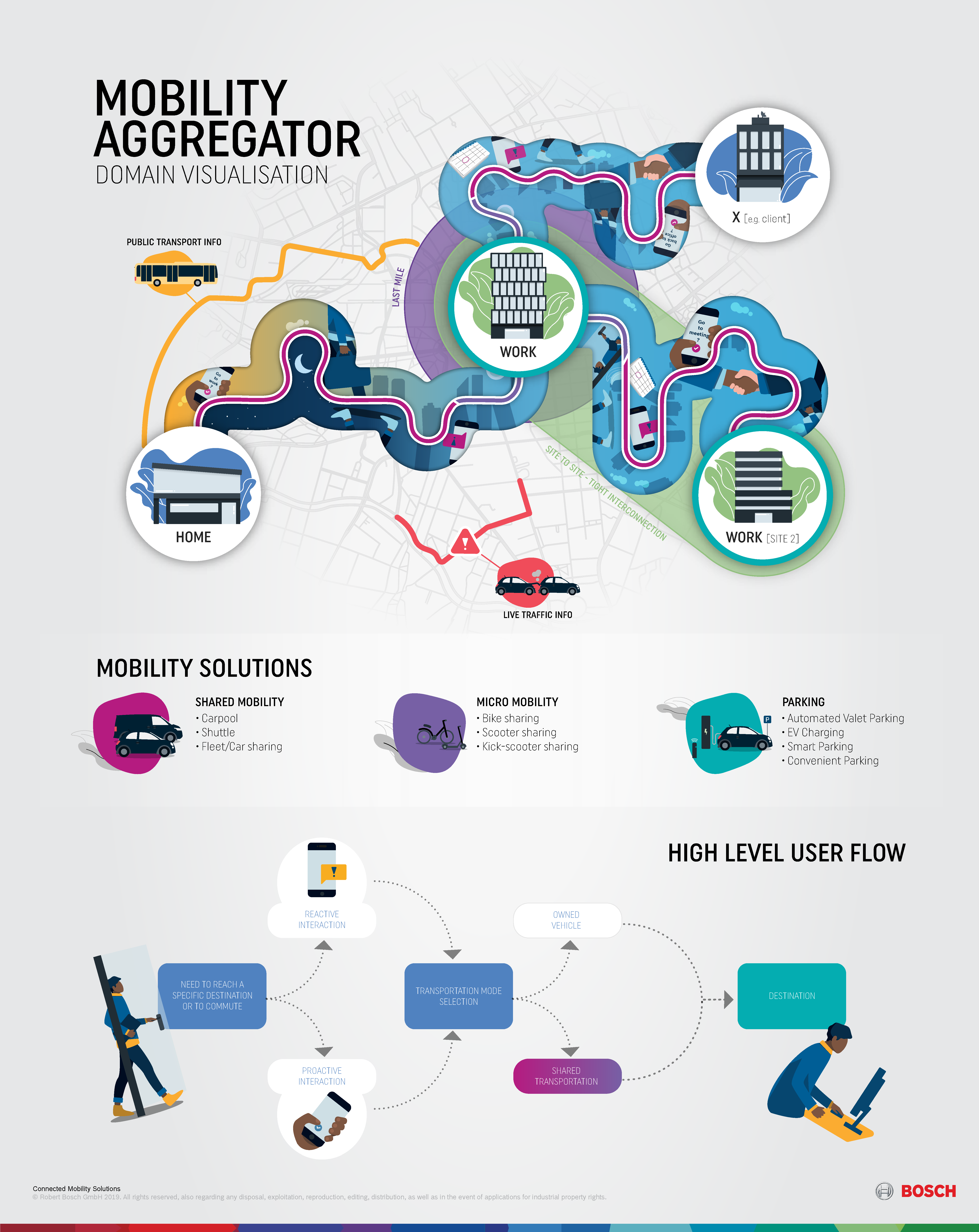
After gathering information about our users, our customers and their respective pains and needs, we moved on to the synthesis. In cooperation with an agency, we developed scenarios and personas during a session ofx Lego Serious Play and got a sense of how and when our users would have touchpoints with our app. We split into two groups and worked on scenarios for our two personas: Mariella, who is young and mostly uses public transport, and Pablo, an older man who commutes to work by car. Their daily commute and thus their needs were very different, as well as what kind of services they would be likely to use. The app would need to be modular and simple, so it could easily be adjusted to their respective needs. We then developed high level and detailed user flows to understand when the app should act on it’s own by sending reminders and notifications, and when the user prefers to interact with it proactively. At this point it was time to show our progress to the customers overseas, for which we developed the domain visualization which showed user flows, the mobility solutions we wanted to place in the app and their domains.
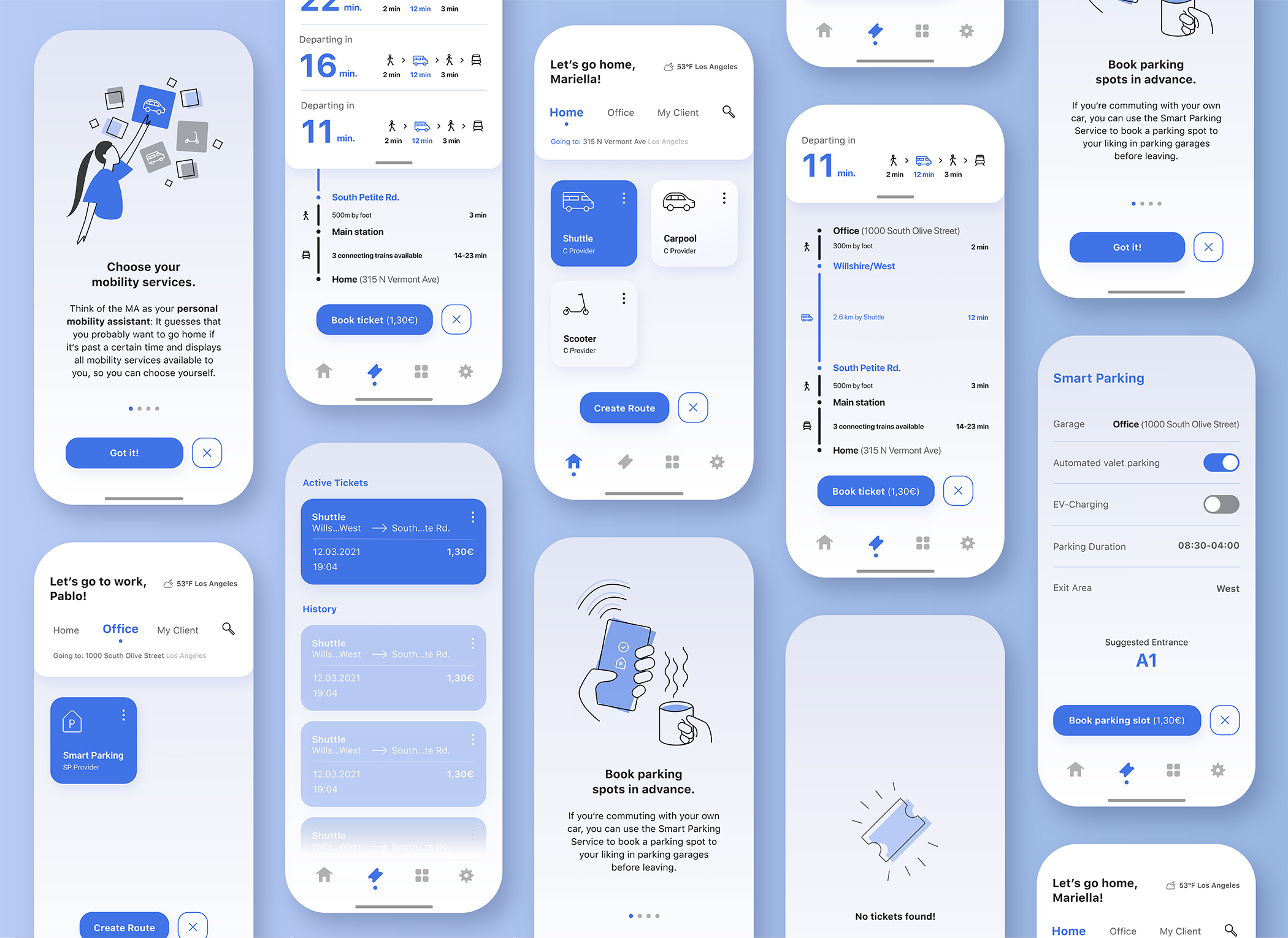
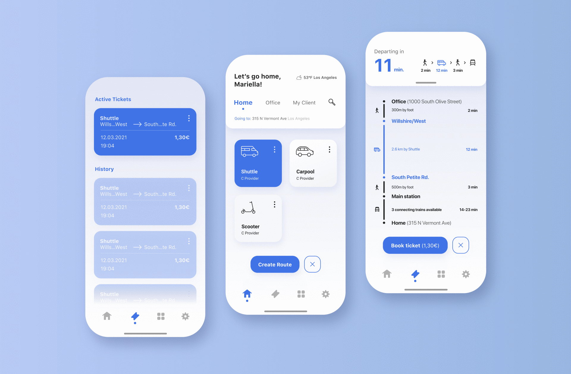
Since we didn’t have time to develop a detailed site map, we settled for focusing on key screens. We identified 5 screens in the user flows we wanted to take into the next step. We worked out an informational structure for the 5 key screens by Wireframing/Scribbling them. Since we did this on paper, we cut out certain elements or modules and place them on the screen in different ways until coming up with something that we liked and that made sense. This was especially handy for the dashboard/home screen of the app, since it’s supposed to be very dynamic and different users, time of the day or location. We could easily change what was displayed for our different personas, f.e. for Mariella there were last mile solutions displayed, while Pablo only was shown the smart parking option, since that’s the only interesting mobility solution for him.
Parallel to Wireframing, we worked on our Moodboard for the App. We involved ourselves in color psychology and determined that our key color should be blue, since this color is most commonly associated with trust and professionalism. In the first iterations of the screen design, we also used a more vibrant secondary and tertiary color, to give the app a more youthful look. Our Moodboard majorly impacted our vision of the app, since we took inspiration from apps that are thematically situated in a completely different field but worked with similar modules and informational structures: smart home and other apps, that aggregate a number of different services/products etc. in one solution.
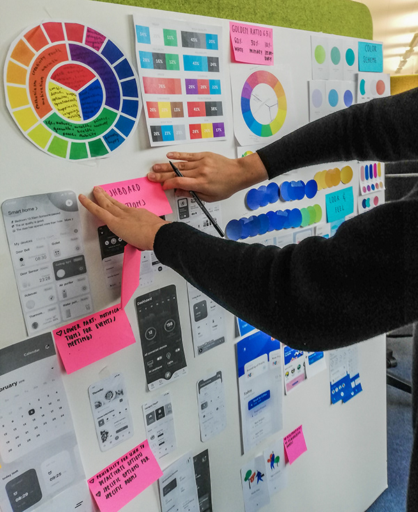
The Screen Design was designed in cooperation with a graphics designer from an agency that was hired.
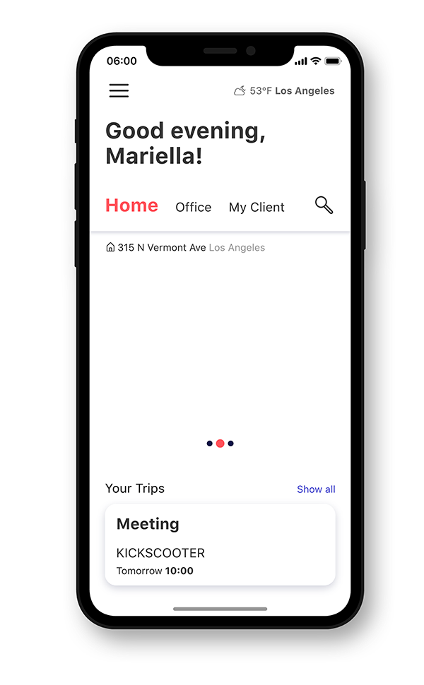
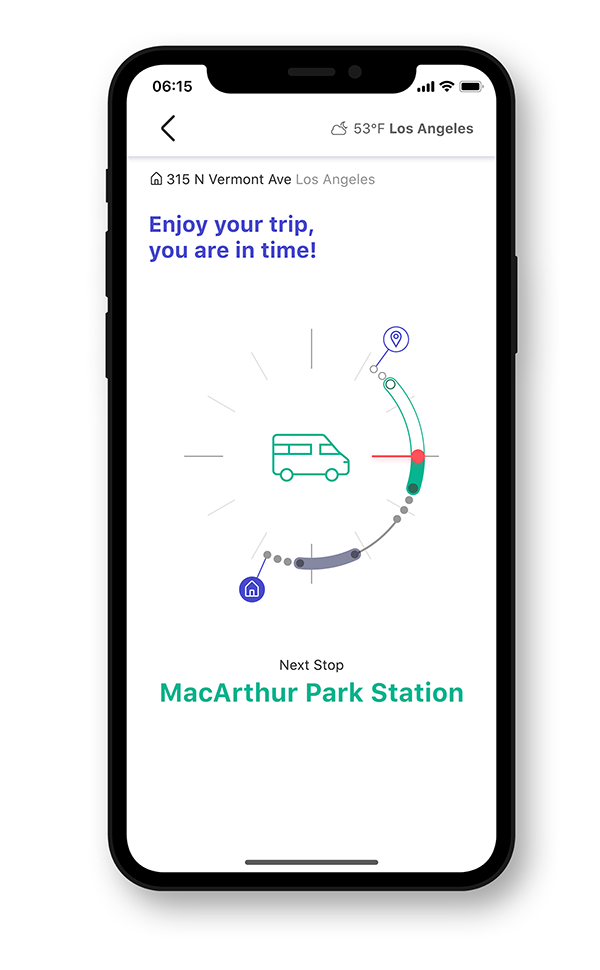
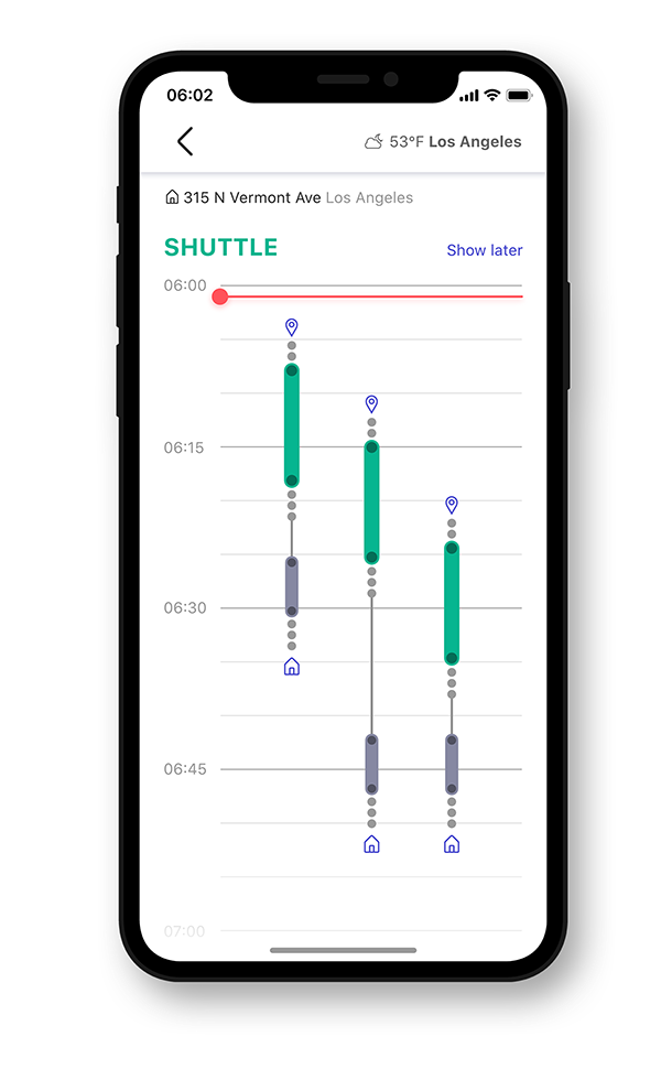
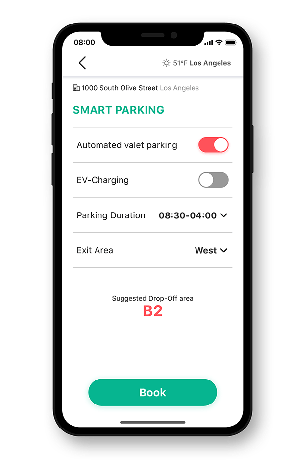
In the most recent iteration I added another key screen, the screen devoted to purchased tickets. Also, I changed the navigation from an exclusively top navigation to a navigation bar at the bottom of the screen. I did this to make sure that the user would be able to easily move from tab to tab, since f.e. the routing process was very likely to be very complicated and long. I changed the screen where the user chooses their route from a timetable view that showed every route available in a certain time frame to a more minimal view that shows the best/recommended route, but still lets the users scroll through other options. I also decided to display all available mobility services in an overview on the dashboard, rather than displaying them in a carousel. This is supposed to make choosing a service easier and more time efficient, than having to scroll through them. Also, I eliminated the secondary and tertiary colors and instead changed the main color to a fresh blue tone to ensure a professional and clean overall feel, since the look of the app itself, with rounded edges and shadows, is youthful and modern enough as it is.